It's been awhile since I shared any blogging tips so today I thought we'd do a little DIY blog design with a really neat new site, BeFunky, where you can design your own graphics for your blog, social media pages and Etsy listings.
I've been using sites like this for a long time to design blogs for friends, family, other bloggers and myself. I've only just started learning to use Photoshop but if you're a blogger or business owner on a budget, graphic design sites like this are invaluable. I use similar photo editors on a near daily basis so I was excited to start playing with the features from BeFunky.
This week, BeFunky launched a new Designer Toolset with loads of professional templates designed for bloggers. Today, I'll show you how to use the blog images templates and blog titles templates to give your post some extra pop. A well designed graphic with text overlay and quality photos will help draw attention to your social media posts and bring more traffic to your blog. Let's get started!
When you log into BeFunky, click the colorful "b" at the top left corner and you'll see a drop down menu of options. From here, select "blogger templates"
The blogger templates section includes everything you'll need for promoting your blog on social media, creating Pinterest friendly graphics and beautiful eye-catching title graphics for your blog.
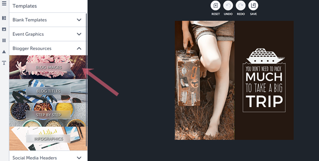
A title graphic is a great tool to implement in your post. When your readers scroll through their blog feeds or Facebook, these attention-getters really draw them to reading your post so make it a good one!
For this tutorial, I'm going to use an old post, my vintage girdle guide. This is a great post but it doesn't get much love so I'd like to bring it back to life. Giving old posts a face lift is a great way to promote old content. I'm going to start with this template, which has nothing to do with vintage or girdles, but you'll see how easy it is to make a template your own!
First, we'll replace the background image. Click the photo icon on the left menu and the next menu will pop up. You can choose an image saved to your computer, your Facebook page or select from over 430,000 free images from Pixabay. I used some keywords like "vintage" "lingerie" "retro fashion" to search Pixabay but I didn't find anything that jumped out so I used a vintage girdle advertisement instead.
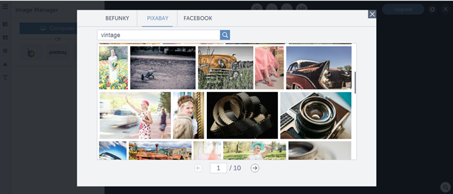
Click on the image in the template and select "replace image". Choose the image that you would like to use on your desktop
To change the text, simply click on the text in the template and a text editor menu will appear. Each line of text can be styled differently, deleted or added to. BeFunky has a large selection of excellent fonts under the "Ours" menu but you have the option to use any of the fonts downloaded to your computer under the "Yours" menu. Change the color, size and spacing in the "edit selection" menu
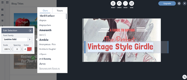
As I was editing the text, I quickly realized that the text would be difficult to read with my image background, which is a common problem. It's very important to choose images with plenty of blank space or a background that isn't too busy, that way your text will pop. Select colors that stand out and compliment your background image as well. In this instance, the background is both black and white so there wasn't really any text color that I could select that would stand out as much as I had hoped. Luckily, I can just grab by image background and move it off to one side, leaving plenty of blank space for my text
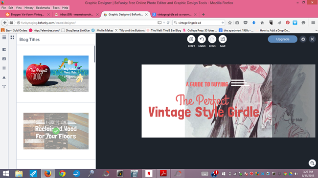
When mixing fonts, you can almost never go wrong with one bold font and one curly font. Here I'm using Grand Hotel and Langdon, both available from BeFunky.
You can also change the decorative graphics. I flipped these little lines and changed them from white to dark gray to match my image. To flip the decorative graphics around, just click them and the menu to change it all around will pop up. Play with it and move it around until its just perfect.
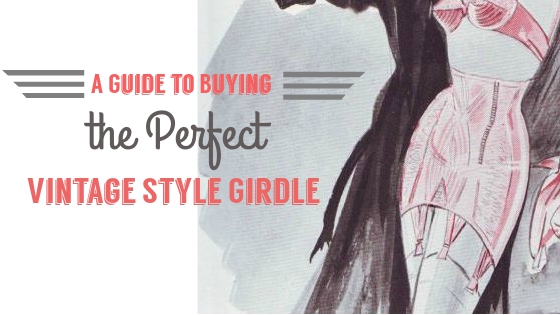
Next, I saved my design to my computer and opened it up in the BeFunky photo editor so I could add a frame. I selected the simple border and dragged the color selector over my text so I could match the colors exactly.
Use these techniques to customize any BeFunky template for your blog. Here's a look at what you can do with the blog images template, using a stock image from Pixabay. Blog images are a great way to promote events on social media, use in your sidebar or in a post.
And here's another before and after using one of the Pinterest templates. In this example, I kept the layout, swapped out the image and changed the color of the circle graphic and re-sized it just a smidge. I'm using Abril FatFace and Raleway fonts. I didn't find any curly fonts that stood out to be so I mixed bold and skinny type.
There's really no limit to what you can do! Also check out the photo editor and collage maker, which has dozens of pre-set templates or the option to make your own, all priceless time saving tools for bloggers.
This post is sponsored by BeFunky. Please see my full disclosure policy.
I've been using sites like this for a long time to design blogs for friends, family, other bloggers and myself. I've only just started learning to use Photoshop but if you're a blogger or business owner on a budget, graphic design sites like this are invaluable. I use similar photo editors on a near daily basis so I was excited to start playing with the features from BeFunky.
This week, BeFunky launched a new Designer Toolset with loads of professional templates designed for bloggers. Today, I'll show you how to use the blog images templates and blog titles templates to give your post some extra pop. A well designed graphic with text overlay and quality photos will help draw attention to your social media posts and bring more traffic to your blog. Let's get started!
When you log into BeFunky, click the colorful "b" at the top left corner and you'll see a drop down menu of options. From here, select "blogger templates"
The blogger templates section includes everything you'll need for promoting your blog on social media, creating Pinterest friendly graphics and beautiful eye-catching title graphics for your blog.

A title graphic is a great tool to implement in your post. When your readers scroll through their blog feeds or Facebook, these attention-getters really draw them to reading your post so make it a good one!
For this tutorial, I'm going to use an old post, my vintage girdle guide. This is a great post but it doesn't get much love so I'd like to bring it back to life. Giving old posts a face lift is a great way to promote old content. I'm going to start with this template, which has nothing to do with vintage or girdles, but you'll see how easy it is to make a template your own!
First, we'll replace the background image. Click the photo icon on the left menu and the next menu will pop up. You can choose an image saved to your computer, your Facebook page or select from over 430,000 free images from Pixabay. I used some keywords like "vintage" "lingerie" "retro fashion" to search Pixabay but I didn't find anything that jumped out so I used a vintage girdle advertisement instead.

Click on the image in the template and select "replace image". Choose the image that you would like to use on your desktop
To change the text, simply click on the text in the template and a text editor menu will appear. Each line of text can be styled differently, deleted or added to. BeFunky has a large selection of excellent fonts under the "Ours" menu but you have the option to use any of the fonts downloaded to your computer under the "Yours" menu. Change the color, size and spacing in the "edit selection" menu

As I was editing the text, I quickly realized that the text would be difficult to read with my image background, which is a common problem. It's very important to choose images with plenty of blank space or a background that isn't too busy, that way your text will pop. Select colors that stand out and compliment your background image as well. In this instance, the background is both black and white so there wasn't really any text color that I could select that would stand out as much as I had hoped. Luckily, I can just grab by image background and move it off to one side, leaving plenty of blank space for my text

When mixing fonts, you can almost never go wrong with one bold font and one curly font. Here I'm using Grand Hotel and Langdon, both available from BeFunky.
You can also change the decorative graphics. I flipped these little lines and changed them from white to dark gray to match my image. To flip the decorative graphics around, just click them and the menu to change it all around will pop up. Play with it and move it around until its just perfect.

Next, I saved my design to my computer and opened it up in the BeFunky photo editor so I could add a frame. I selected the simple border and dragged the color selector over my text so I could match the colors exactly.
 |
| Before Customizing the Template After working some BeFunky magic |
Use these techniques to customize any BeFunky template for your blog. Here's a look at what you can do with the blog images template, using a stock image from Pixabay. Blog images are a great way to promote events on social media, use in your sidebar or in a post.
 |
| BeFunky Template After Customization |
And here's another before and after using one of the Pinterest templates. In this example, I kept the layout, swapped out the image and changed the color of the circle graphic and re-sized it just a smidge. I'm using Abril FatFace and Raleway fonts. I didn't find any curly fonts that stood out to be so I mixed bold and skinny type.
There's really no limit to what you can do! Also check out the photo editor and collage maker, which has dozens of pre-set templates or the option to make your own, all priceless time saving tools for bloggers.
This post is sponsored by BeFunky. Please see my full disclosure policy.


Very cool! Thank you for the great introduction to BeFunky.
ReplyDelete♥ Jessica
I'm downloading the app as I type this, thanks for the recommendation. Looks like a lot of fun!
ReplyDeleteAwesome! Can't wait to try this site, thanks!
ReplyDeleteThis looks like it will be fun to play around with! It reminds me a bit of an app called Word Swag, but with more versatility.
ReplyDeleteNever took time to make a true design for my blog.... never study all possibilities... perhaps one day...
ReplyDeleteThanks for sharing!
Good post
ReplyDeleteHow many times have you changed your blog theme recently? Spend more time writing posts and less time tinkering with your choice of themes. Read about the three reasons why I made the decision to stay with Thesis Theme.Online Marketing
ReplyDelete